Python animations: enhancing data visualisations
Ever wondered if money could buy health? Well, it might not buy happiness directly, but it could add a few years to your life! In this post, we’re diving into the interesting connection between a nation’s wealth and its health.
I am going to use Python animations and World Bank data to show how closely the world’s GDP correlates with life expectancy. We might find some interesting patterns!
GDP per capita & Life Expectancy are correlated. While preparing these two datasets for the last 20 years (2003 to 2022), I discovered interesting inequalities, diminishing returns, and outliers.
Static charts often miss the small details or fail to share the complete story. Animations can help reveal those nuances.
Do you know that in 2003, Luxembourg’s GDP per capita was 8x India’s, and by 2022, it was 12x? Yet, the life expectancy gap narrowed by 1.5 years.
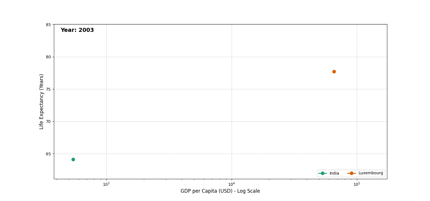 Luxembourg’s wealth surge vs India’s health gains (2003–2022)
Obviously, you can argue that Luxembourg is already rich and India still has a long way to go as a developing nation — and you’d be right.
The point I want to make here is that life expectancy tends to plateau once a country reaches a decent GDP per capita.
Data & Tools
Datasets
Data Manipulation
- Life expectancy (birth) - original dataset
| Country Name | Country Code | Indicator Name | 1960 | 1961 | 1962 | 2000 | 2001 | 2002 | 2003 | 2022 |
|---|---|---|---|---|---|---|---|---|---|---|
| Dominica | DMA | Life expectancy at birth, total (years) | 59.026 | 59.949 | 61.741 | 72.693 | 71.713 | 72.340 | 71.438 | 72.981 |
| Lithuania | LTU | Life expectancy at birth, total (years) | 69.847 | 70.103 | 69.095 | 70.909 | 71.220 | 71.571 | 72.020 | 75.793 |
| Ecuador | ECU | Life expectancy at birth, total (years) | 53.364 | 53.895 | 54.401 | 72.839 | 73.240 | 73.613 | 73.975 | 77.894 |
- GDP per capita - original dataset
| Country Name | Country Code | Indicator Name | 2016 | 2017 | 2018 | 2019 | 2020 | 2021 | 2022 | 2023 |
|---|---|---|---|---|---|---|---|---|---|---|
| Heavily indebted poor countries (HIPC) | HPC | GDP per capita (current US$) | 893.010597521193 | 931.787880001889 | 968.18729528141 | 976.312547557857 | 959.181737577661 | 1040.03410722444 | 1100.34076496851 | 1231.81257022963 |
| Channel Islands | CHI | GDP per capita (current US$) | 55950.1485360363 | 55806.5709126142 | 60783.3533081111 | 60568.1085272721 | 56785.9402392525 | 66912.1750054447 | 67627.3082341446 | 74589.1380225191 |
| Barbados | BRB | GDP per capita (current US$) | 19065.8069800213 | 19692.7606711615 | 20055.915870771 | 20583.7265786414 | 18347.1109131055 | 18696.7858952957 | 22164.0260273876 | 23804.0249914995 |
- After transformation (check the
for data manipulation)
| Country Name | Country Code | Year | GDP per Capita | Life Expectancy | Country Type | Is Top 5 |
|---|---|---|---|---|---|---|
| Portugal | PRT | 2018 | 23541.140108 | 81.324390 | country | False |
| OECD members | OED | 2006 | 31680.214935 | 78.295376 | economic_group | False |
| Bulgaria | BGR | 2013 | 7687.713682 | 74.860976 | country | False |
| United Arab Emirates | ARE | 2022 | 49899.065298 | 79.196000 | country | False |
| Low income | LIC | 2009 | 673.128726 | 59.243678 | income_group | False |
| Liberia | LBR | 2016 | 714.613063 | 60.416000 | country | False |
| Ireland | IRL | 2003 | 41203.529585 | 78.139024 | country | False |
| Canada | CAN | 2005 | 36383.660007 | 80.112683 | country | False |
| Small states | SST | 2022 | 14371.493594 | 72.183069 | country | False |
| Jamaica | JAM | 2013 | 5124.213014 | 73.412000 | country | False |
| Kyrgyz Republic | KGZ | 2022 | 1739.720308 | 72.048780 | country | False |
| Mozambique | MOZ | 2004 | 400.056973 | 51.249000 | country | False |
| Sri Lanka | LKA | 2005 | 1207.219948 | 72.118000 | country | False |
| Chile | CHL | 2010 | 12632.870473 | 78.501000 | country | False |
| Grenada | GRD | 2009 | 6932.564722 | 75.036000 | country | False |
- Python Libraries:
- Plotly for interactive animations.
- matplotlib.animation for simple animations.
- Pandas for data handling.
Analysis (with code)
Through 20 years of data (2003-2022), three patterns emerged:
- Stark inequalities: The rich-poor health gap persists.
- Diminishing returns: Health gains slow down after certain wealth levels.
- Outliers: Some nations punch above their weight.
The Big Players
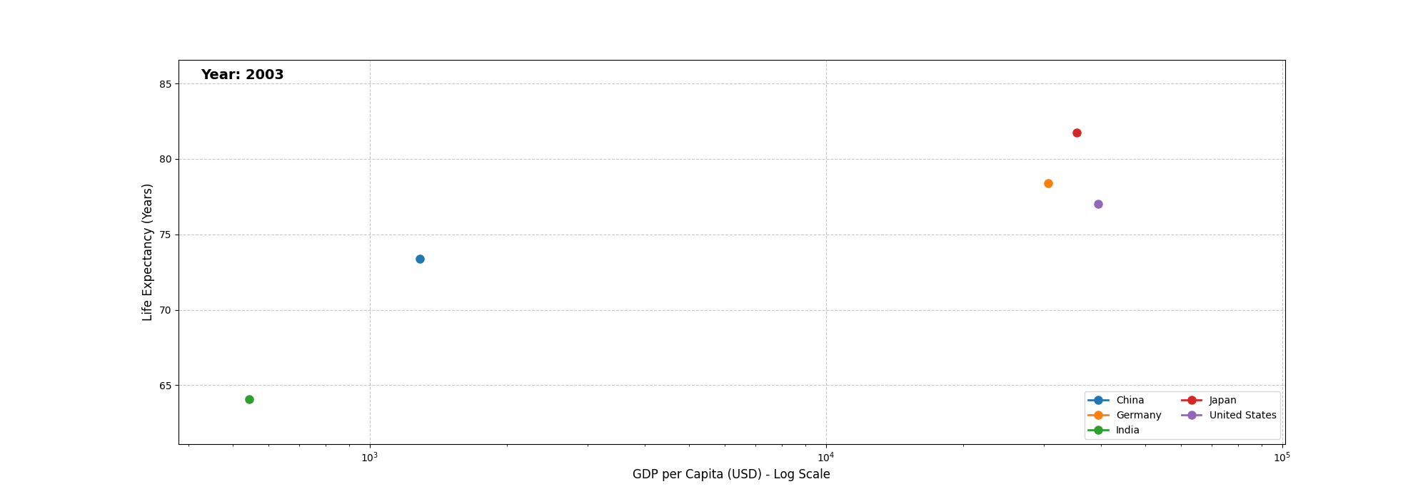 Economic heavyweights (2003–2022)
Income Groups Tell All
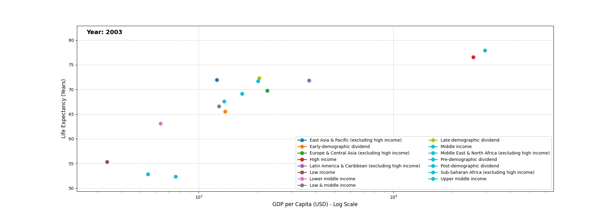 The wealth-health spectrum
You can find the complete Python code 🔗 here.
The notebook includes both matplotlib and plotly animation code, along with ipywidgets. It’s always tricky generating GIFs using plotly. If you need GIFs for your presentation, stick with simplicity over aesthetics. I’d advise going for simplicity over aesthetics. matplotlib can simply solve it for you. Also, CXOs and stakeholders rarely care about aesthetics.
These animations are supposed to support your story.
Pro Tip: Pro Tip: Presenting to execs?
- Use matplotlib’s simplicity over plotly’s flair.
- Prioritise clear motion over fancy transitions.
- Follow the 3-second rule: If it isn’t clear in 3 seconds, simplify.
Conclusion
While wealth enables health investments, the relationship isn’t linear. Two key takeaways:
- Critical threshold: ~$5k GDP/capita brings biggest health jumps.
- Post-$30k plateau: Beyond this point, additional wealth has diminishing health returns.
This was just one lens on how data storytelling can surface deeper insights.
If you’re presenting to decision-makers, show trends that matter, but don’t lose them in the glitter.
More experiments on the way! 🚀